Putting thinking before design Morse Brown Design

Putting thinking before design

20 July 2017

With our wide experience of web and interface design and development, for both commercial and public-sector organisations, we have developed, over time, a number of design principles that we use across all of our web projects (and the general principles also apply to design for print). And it's interesting to note that the first two steps are both 'thinking' steps. In other words, there's a lot of work to do behind the scenes before you start to see anything that could be called design.

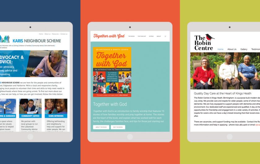
This is one of the things that really sets designs apart, and makes the difference between 'pretty' design and 'great' design. Anyone can make nice-looking websites (or brochures), but it's the ones that have had a lot of behind-the-scenes thought put into them that really stand out.

  1. RESEARCH. This is the first stage in our process. We like to know what else is out there. How do the websites of other organisations in your sector work? Are there any best practices we can make use of? And then we like to take it one step further, and widen our research by looking at the sites of organisations that have a similar demographic, or organisations in related but not identical fields. This has served us very well on other occasions, and means that we design and build sites that extend the limits of what is possible and what is common in your sector. It also means we design sites that are ‘differentiated’ – i.e. it’s not ‘just another care home website for example’.
  2. SITEMAP. Next, we produce what is known as a sitemap. This is a visual map of everything on your site – all of your content. This is an extremely important stage, because it's here that we define what the various sections on your website are – what content goes where. We like to streamline your content as much as possible, so that it's as easy as possible to find a bit of content on your new website.
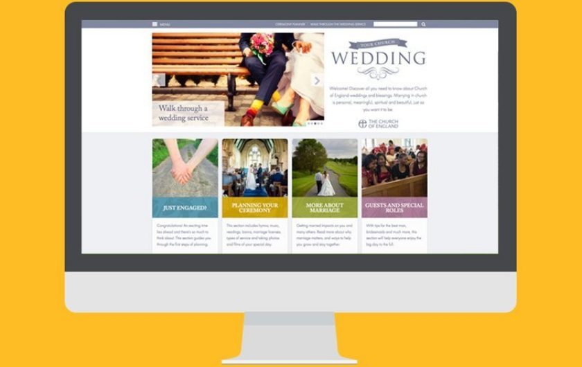
  3. Wireframes. The final bit of the 'thinking' stage is the production of a series of 'wireframes'. These are very simple layouts, showing what content goes where on your site - particularly on your homepage. Different areas of a screen have different values – you may notice that many sites but their most important 'call to actions' towards the right hand side of the screen or in the middle. This is because most people look here first. You very rarely see an important call to action on the left of a screen. So we work out (with your help) which of your content needs to be most visible, and then decide where it's going to go on the screen.

The huge advantage of doing these three steps is that it really helps to streamline the design process. By the time you've got to the end of step three, you have a very clear idea of how the website is going to work.

All that remains is to produce a stunning design! Simples! 🙂

Need a website designing and need help with the background thinking? Drop us a line.

Pigeon

Pigeon

A new and exciting product from Morse-Brown Design – head over to pigeonposted.com for more info. More

Parish share leaflets for Blackburn Diocese

Parish share leaflets for Blackburn Diocese

Communicating complex information well – this is the role of good graphic design, and this is what we set out to do for Blackburn Diocese. Turning information into art – art to be read, absorbed and acted upon. Art to inspire, lead and guide. More

Valley House branding & web design and build

Valley House branding & web design and build

We were delighted to start work with Valley House, a multi-agency charity that had outgrown its old brand and website. Face to face meetings, in-depth research and a lot of design work has produced a contemporary new brand and responsive website for the organisation. More

Simple websites for small budgets

Simple websites for small budgets

Think you don’t have the budget for a clean, professional looking website? Think again! We have helped many small organisations, from churches to charities to start-ups, create a beautifully designed, bespoke site to showcase their work to a wider public. More

Woodbrooke Quaker Study Centre rebrand

Woodbrooke Quaker Study Centre rebrand

A contemporary new brand for the Woodbrooke Quaker Study Centre. Deliberately simple, demonstrating the calm and tranquillity of the amazing Woodbrooke grounds, and their wonderful ethos. More

Branding for the BBC

Branding for the BBC

We were approached by the BBC to design new branding for their Leadership Programme, a new training course from the BBC Academy. A comprehensive brief and a lot of hard work resulted in a successfull delivery on a pretty tight deadline. More

Illustrating for the BBC

Illustrating for the BBC

As well as web design, branding, and graphic design, we also provide bespoke illustrations in a wide variety of styles. This series was commissioned by the BBC for a studio directing exercise using virtual reality. One very satisfied client… More

Welcoming Students Guide

Welcoming Students Guide

Another book published for Student Christian Movement – this time a resource for churches on making students feel welcome. The complete publishing package, with an ISBN number and a page on Amazon. More

Branding for Blackburn Diocese: Vision 2026

Branding for Blackburn Diocese: Vision 2026

We were delighted to have won the pitch to design new branding for Blackburn Diocese’s Vision 2026 programme of growth – a brand to unify communication and show the importance of growth across the whole diocese. More

Rebranding a 100-year-old organisation

Rebranding a 100-year-old organisation

Rebranding an organisation that’s been around for a century is a little scary… But we succeeded, and the design has been really well received. We’ve incorporated it into a new magazine layout and lots of other printed material. More

Brochure design –  when simple is best

Brochure design –
when simple is best

When St Peter’s Saltley Trust came to us for a brochure, we designed them this little folder. At only 148 x 148mm and four pages, it’s cheap to produce, can be tailored to specific occasions, and it’ll be good for years to come. Job done. More

Welcome packs for churches

Welcome packs for churches

Very few churches have anything nice to give to new-comers, to explain what they do and how their church works. This is our solution – a cost-effective and beautifully designed set of postcards, either in a folder with an introductory booklet, or displayed in the foyer. Or both. More

Together with God, by Ed Mackenzie & Gareth Crispin

Together with God, by Ed Mackenzie & Gareth Crispin

We have the skills, experience and tools to provide a complete publishing package for any book, from design to actual fulfillment. This is the service we provided for Ed and Gareth when they approached us with their book idea, and it’s been very successful. More

Diocese of Southwell & Nottingham website design

Diocese of Southwell & Nottingham website design

A new website for the Diocese of Southwell & Nottingham, won after a three-way pitch. Our fourth Church of England Diocesesan website – as a friend remarked – you can’t work for a higher authority than that… More

St Peter’s Saltley Trust;  identity design

St Peter’s Saltley Trust;
identity design

A brand identity project for an educational charity working across the West Midlands region. An identity that needed to say ‘professional, intelligent and contemporary’, without being showy or clichéd in any way. More

Oxford Diocese:  Living Faith campaign brand

Oxford Diocese:
Living Faith campaign brand

A five year campaign identity for Oxford Diocese. This has become such a strong brand for the Diocese that we were subsequently asked to base the design of their new website on the Living Faith colours. More

Oxford Food Bank report

Oxford Food Bank report

A clean, uncluttered and contemporary design for a report of huge significance – the rise of food banks in Oxfordshire, one of the richest areas of the country. This was another job where the design included simple branding. More

Best Group Brochure

Best Group Brochure

A clean, contemporary and professional brochure design, complimented with stunning images of car parks (yes, you can get stunning images of almost anything these days!) for a global financial company to advertise their new Car Park Fund. More