Client: Student Christian Movement (SCM)
Total organisational rebrand
Student Christian Movement – rebrand
We have worked for SCM for many years, and we were delighted when they asked us to quote for rebranding the organisation. Not to say a little daunted, it having been in existence for over a century... But we like a challenge, and following a briefing meeting with the head office team, we submitted a range of designs for their consideration.
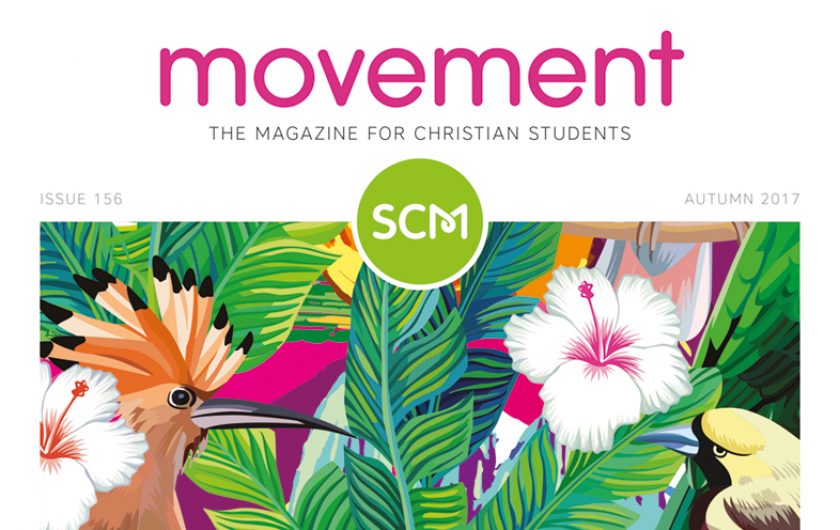
As well as being a movement, SCM is also very much a community – an inclusive organisation that brings people together. And the design that they chose emphasises that aspect of SCM in a simple, contemporary and typographical way, with the looped link within the letter M.
As well as producing the main, new brand, we suggested the logo could also be used as a badge. So we also supplied them with a colour chart and the logo in six different colours for use on promotional material.
As the new brand becomes more well known, this is the sort of design that would allow the words to eventually be dropped altogether, providing a very simple, sleek, distinctive icon to represent the organisation.
Finally, as SCM's flagship magazine (which we also design) is called 'Movement', the logo has the added benefit of the ‘M’ relating strongly to the magazine name.
Looking for a fresh, new brand for your organisation? Drop us a line or give us a call on 0121 212 9857.


