Client: Woodbrooke
www.woodbrooke.org.uk
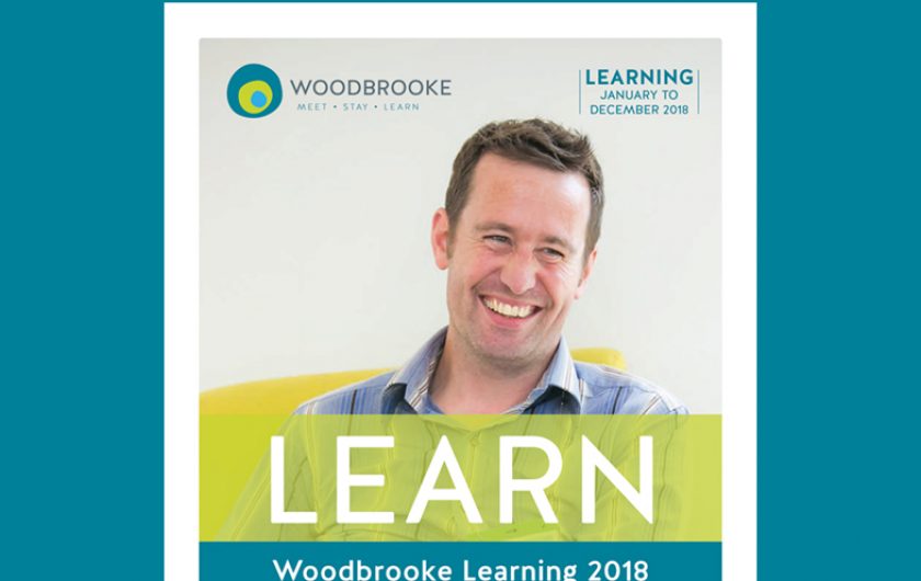
Rebranding Woodbrooke.
The only reason we knew that Woodbrooke was even looking for an agency to rebrand and redesign their website was because an existing client of ours alerted us to the fact (which in itself was a lovely compliment for the work we've done with them). So we pitched for the job and were extremely pleased to have won. Woodbrooke has been an absolutely delightful organisation to work for to this day.
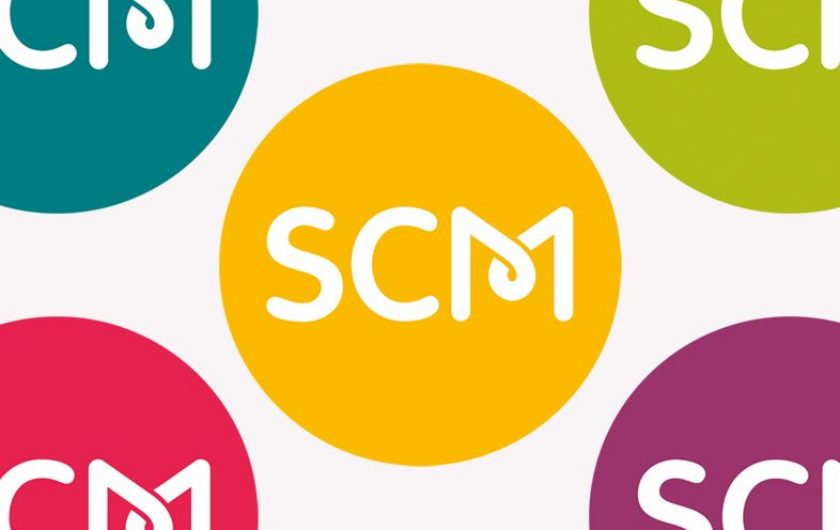
We began with the branding - in total, we produced eight very different designs for them to choose from. The design they finally chose was a radical departure from their existing brand (a silhouette of a tree reflected in a lake) and is the sort of design that allows different people to draw different meanings from (which we really like). The meanings we saw in the design were as follows: We designed it to be a very simple brand, encompassing Woodbrooke's three main areas of expertise (meetings and conferences, accommodation and courses). But it also speaks of countryside, calm and tranquillity.
The circles are deliberately not perfect circles, as they emphasise the warm and very human style of the service that Woodbrooke provides. We could also see a very simple tree-ring representation in the brand, speaking of growth, sustainability, and longevity.
Once the brand had been finalised, we started work on the Woodbrooke website design and build.
In 2020 we supported Woodbrooke in adjusting their branding to refocus the three areas to represent Learning, Research, and Worship. These were the three new priorities as the charity moved away from its physical location and corporate activity.

